Annual reports are packed with numbers but the smartest companies know that how you visualize those numbers often matters more than the numbers themselves.
One visualization that quietly delivers disproportionate insight is the Sankey diagram.
From energy flows to revenue allocation, carbon emissions to cash movement, Sankey diagrams help executives and analysts answer one deceptively simple question:
“Where is everything really going?”
In this article, we’ll break down:
- What a Sankey diagram is (in simple terms)
- How it’s constructed
- Why it’s uniquely powerful
- How global companies use it in annual reports
- What insights you can extract that tables and bar charts simply can’t
What is a Sankey Diagram?
A Sankey diagram is a flow diagram where:
- Nodes represent categories or stages
- Links (flows) represent movement between them
- The width of each flow is proportional to quantity
In other words:
Thicker flow = more volume / value
Unlike traditional charts that show levels, Sankey diagrams show movement and distribution.
Why Sankey Diagrams Are So Powerful
Most charts answer:
- How much?
- How many?
- How did this change over time?
Sankey diagrams answer:
- Where did it come from?
- Where did it go next?
- How much was lost, retained, or transformed along the way?
They are especially effective when:
- Inputs split into many outputs
- Outputs originate from many inputs
- You want to expose inefficiencies, concentration, or leakage
Anatomy of a Sankey Diagram
Let’s break it down:
1. Nodes
These are the stages or entities in the flow.
- Revenue sources
- Cost categories
- Energy types
- Regions
- Business units
2. Flows (Links)
- Connect one node to another
- Width is proportional to value (money, energy, emissions, users, etc.)
3. Conservation Principle
In most Sankey diagrams:
Total input = Total output (after splits)
This makes discrepancies and losses immediately visible.
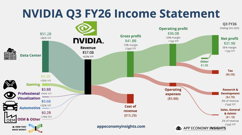
Example: Revenue & Profit Flow – NVIDIA (Annual Report Perspective)
Use case: Revenue generation → business segments → cost allocation → operating profit
Typical Sankey Structure
Inputs (Revenue Sources)
- Gaming
- Data Center
- Professional Visualization
- Automotive
- OEM & Other
Transformation (Value Creation & Cost Absorption)
- Compute & Networking platforms
- Graphics & GPU platforms
- AI software & ecosystem investments
- R&D expenditure
- Manufacturing & supply chain costs
- Sales, marketing & administrative overheads
Outputs (Financial Outcomes)
- Cost of Revenue
- Operating Expenses
- Operating Income (Profit)
- Reinvestment into R&D
Key Insights
- Data Center flows dominate profit output, not just revenue input.
- Gaming contributes stable inflow but proportionally less to profit growth.
- R&D absorbs a thick, consistent flow across all revenue streams, signaling long-term moat building.
- Automotive and OEM flows remain thin, reflecting optionality rather than current scale.
Similarly, a few more examples for references –
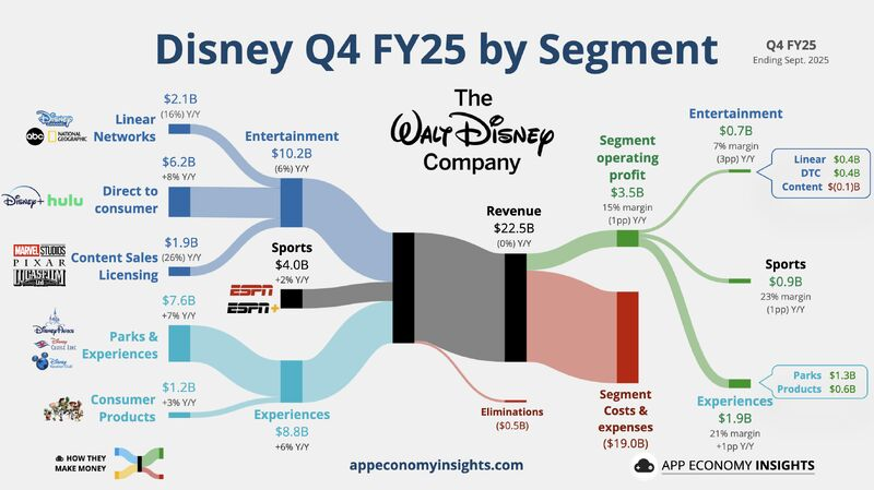
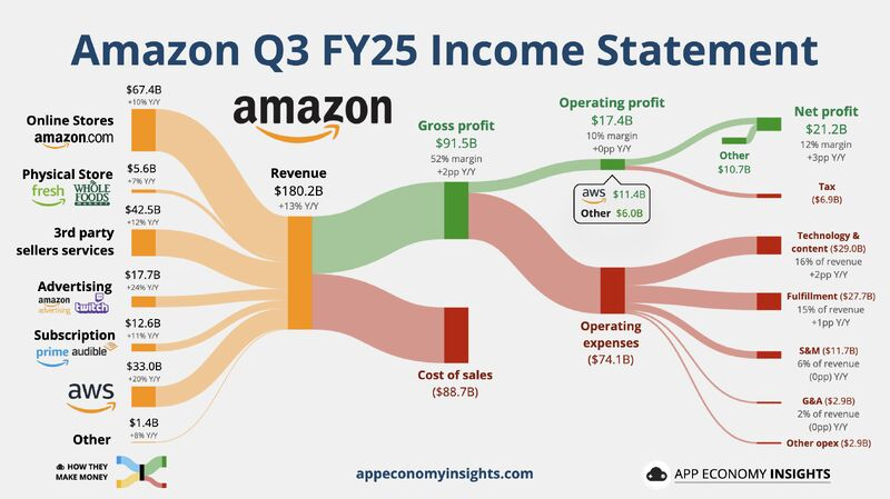
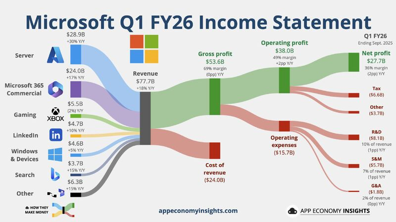
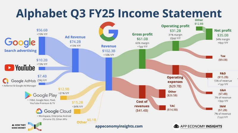
Images credit: App Economy Insights
Sankey diagrams don’t just visualize data – they reveal truth through flow.
They help organizations move from:
- Static reporting → dynamic understanding
- Siloed metrics → system-level thinking
- “What happened?” → “Where should we intervene?”
In a world drowning in dashboards, the Sankey diagram remains one of the most honest ways to show how value actually moves through a business.